Poetsen One Font
Free for Commercial UseAbout
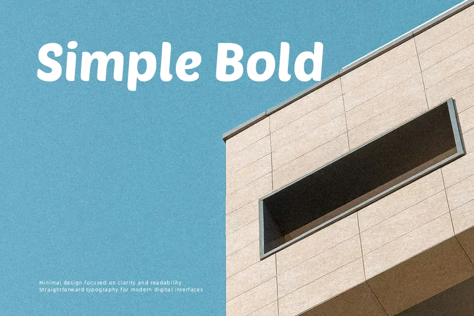
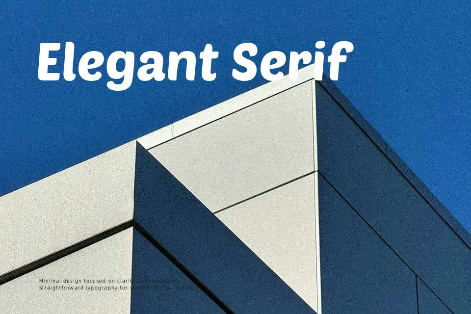
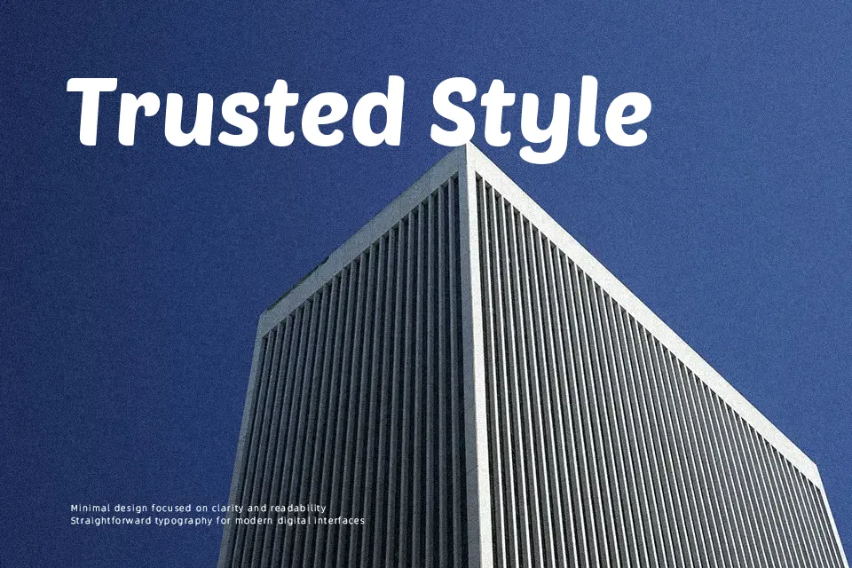
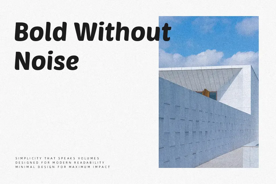
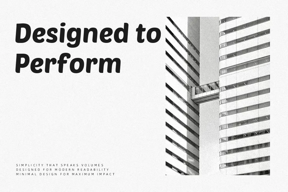
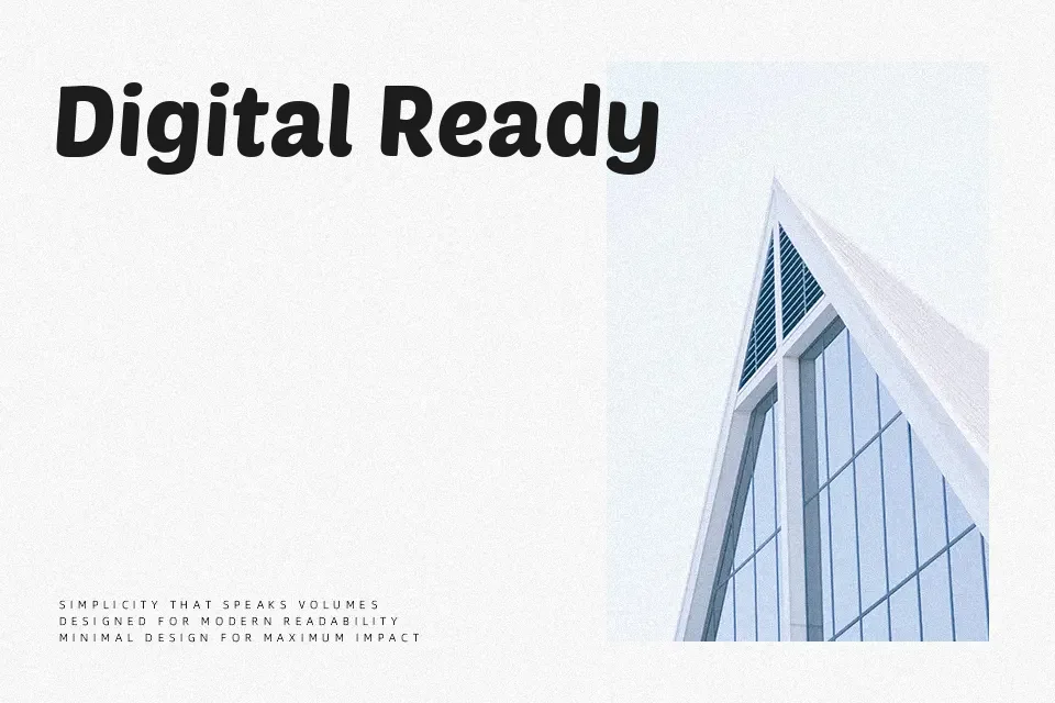
Poetsen One is a chunky, rounded sans serif with thick strokes, low contrast, and compact caps that still feel open and approachable. Its large x-height keeps short paragraphs readable, while the smooth curves and tight rhythm push it toward a display look rather than long-form text. The design pulls from hand-painted supermarket signage and Roman letter skeletons, so it sits somewhere between casual signpainting and structured geometric sans. I reach for it when a project needs loud, friendly typography—logos, banners, kids’ products, or upbeat social graphics—but avoid it for dense copy or serious editorial layouts where the weight and personality become tiring fast.
Best For:
bold display headlines and banners
friendly branding for kids or family products
playful posters and advertising with short copy
eye-catching social media graphics and thumbnails
Not Ideal For:
long body text or text-heavy layouts
formal editorial, legal, or corporate documents
interfaces that demand highly neutral typography
very small captions where heavy strokes blur details
Perfect for branding, headline, and logo, with a bold and display style.
License
Gallery