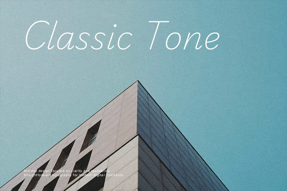
Playwrite NZ Font
Free for Commercial UseAbout
Playwrite NZ takes its cues from school handwriting, with monoline strokes, modest contrast, and open counters that stay legible even when you scale it down on worksheets or mobile screens. The rhythm feels informal and human, but the underlying structure is consistent enough that lines of text don’t fall apart in longer notes or instructions. It leans clearly into a handwritten display look, so it brings personality to headings, posters, and classroom materials rather than disappearing like a neutral text face. I would reach for it when I want a friendly, school-centric voice; I would avoid it for dense reports, formal editorial layouts, or stringent accessibility guidelines where a more conventional sans or serif reads better over many pages.
Best For:
classroom posters and worksheets
educational branding and learning apps
friendly headers on school or kids’ websites
Not Ideal For:
long-form body text or dense documents
very formal corporate reports
interfaces that demand highly neutral typography
Perfect for branding, kids, and poster, with a clean and display style.
License
Gallery