Almendra SC Font
Free for Commercial UseAbout
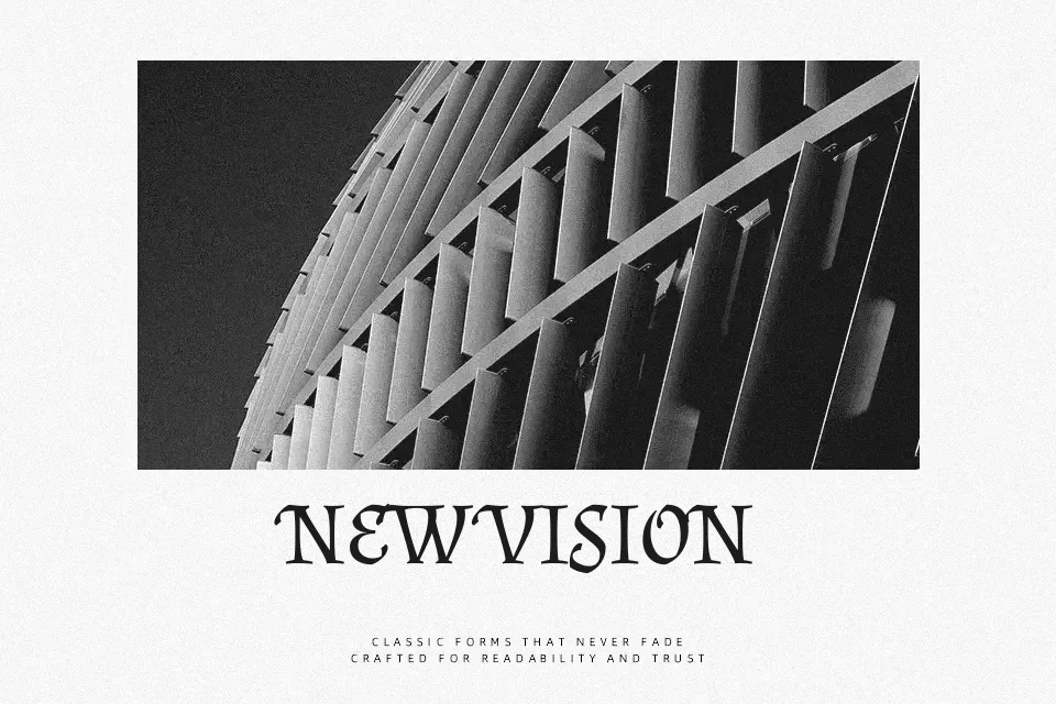
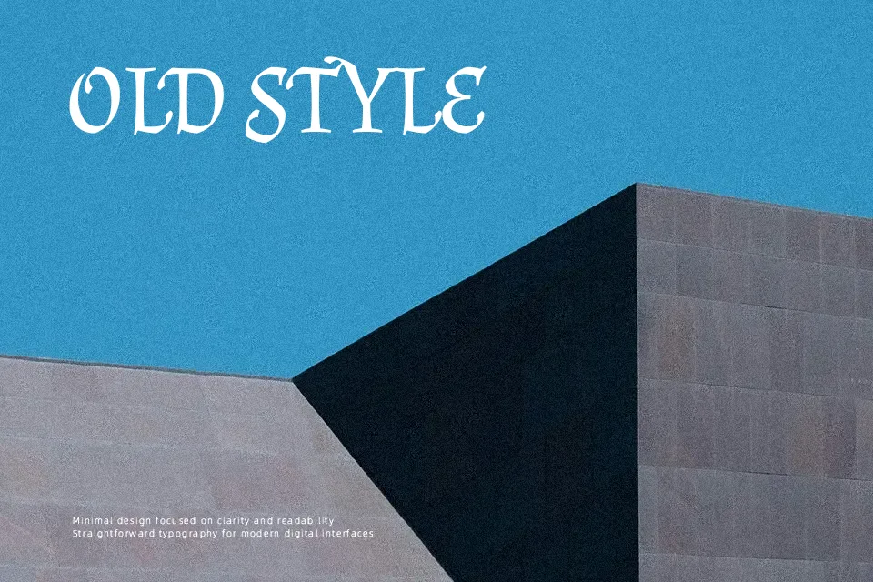
Almendra SC is serif built from chancery and gothic calligraphic roots, so letters feel angular yet still readable, with slightly sharp terminals and a compact vertical rhythm that holds together in blocks of text. The strokes lean moderately contrasty rather than ultra-thin and thick, giving enough texture for headlines while avoiding a decorative overload that would tire the eye in medium-length copy. It works nicely on fantasy book titles, historical menus, indie game interfaces, or literary branding where you want a touch of old-world drama without going full blackletter. For dense manuals, minimalist tech brands, or very small UI labels, its personality can feel too ornate and slightly heavy, so a more neutral serif or sans would behave better.
Best For:
atmospheric book covers
fantasy or gothic branding
story-driven poster titles
thematic UI labels in games
Not Ideal For:
long technical documentation
minimalist corporate branding
tiny body copy on screens
clean modern web interfaces
Perfect for branding, editorial, and headline, with a ancient and display style.
License
Gallery