Playfair Font
Free for Commercial UseAbout
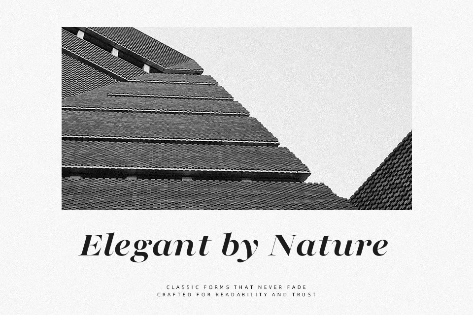
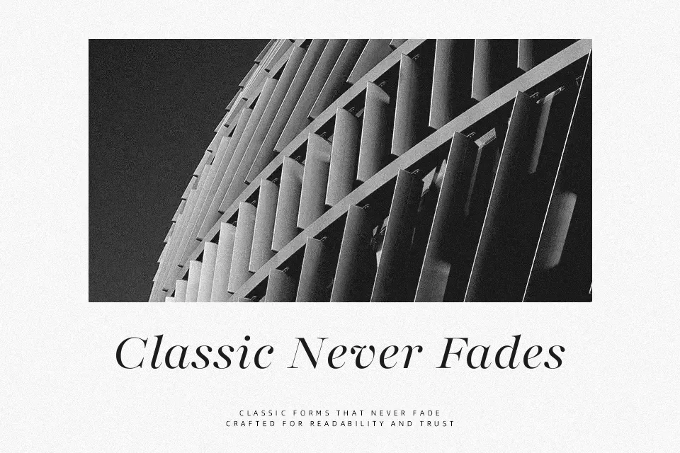
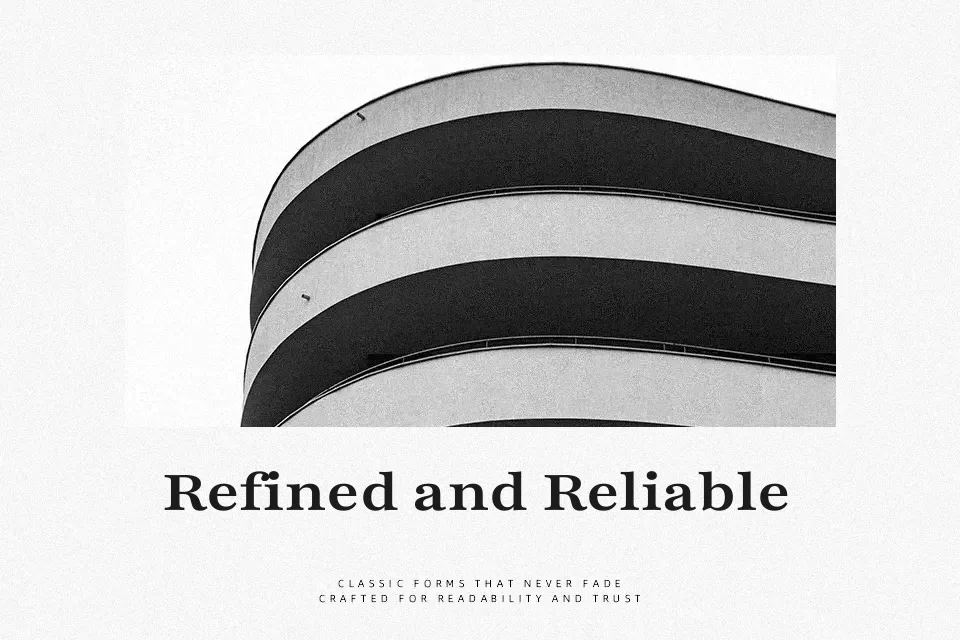
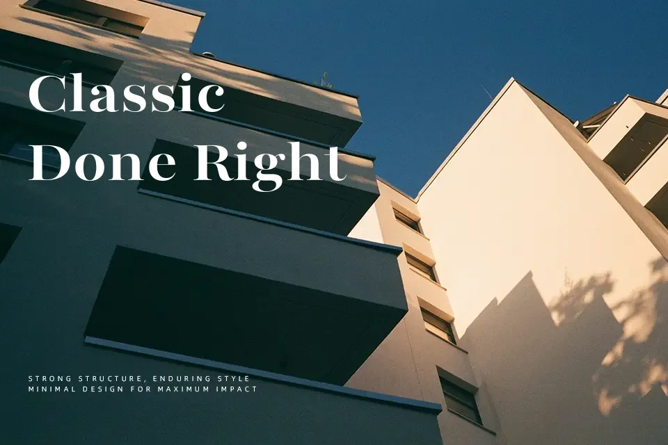
Playfair combines sharp contrast, fine hairlines, and generous x-height to create a serif that feels both traditional and contemporary on screen. Its vertical stress, crisp serifs, and compact descenders let you stack headings tightly without looking cramped, which is helpful for magazines, blogs, and packaging that need hierarchy in limited space. Visually it leans formal and literary, so it supports brands that want a cultured or editorial voice more than loud, shouty campaigns. I reach for it when a project needs typographic nuance in headlines and short pull quotes, paired with a simpler sans for body copy; for dense paragraphs or tiny UI labels, its contrast can feel a bit fragile and fussy.
Best For:
Editorial headlines and article titles with a literary feel
Branding and logos for bookish, culture-focused projects
Covers, posters, and hero sections that need elegant impact
Not Ideal For:
Very small body text where the high contrast reduces legibility
Harsh, utilitarian interfaces or technical dashboards
Playful kids content that needs softer, rounded forms
Perfect for branding, editorial, and headline, with a classic and serif style.
License
Gallery