Playfair Display Font
Free for Commercial UseAbout
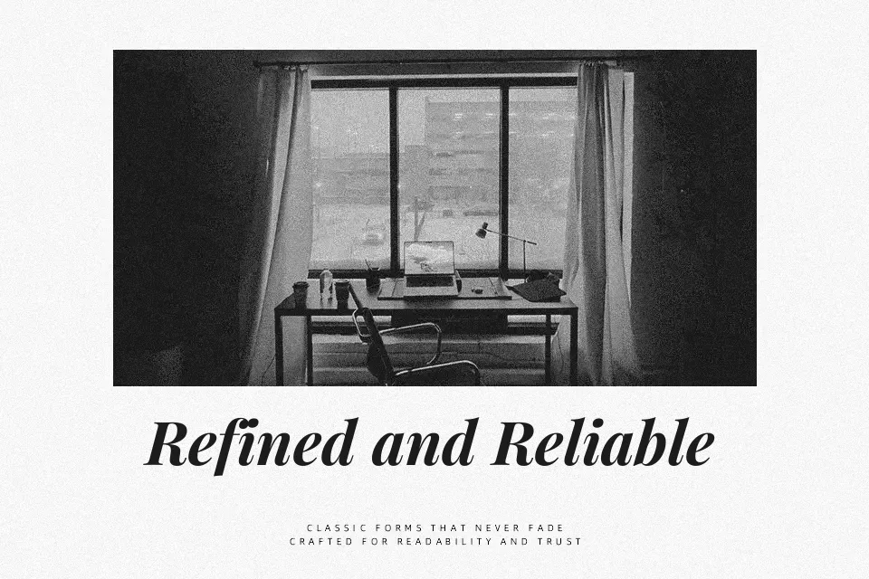
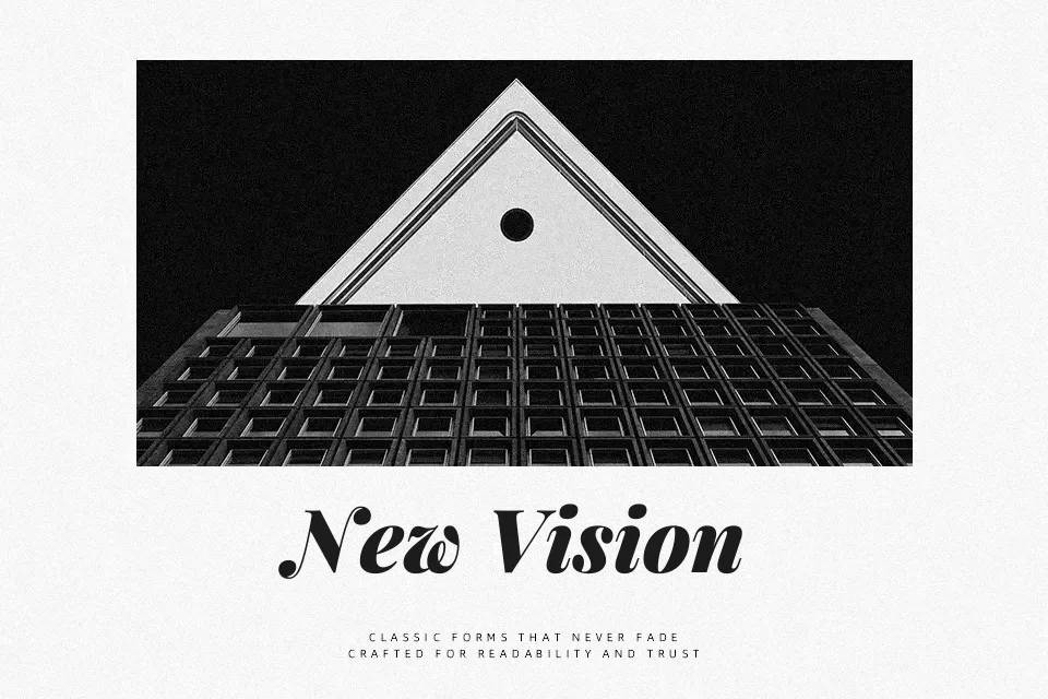
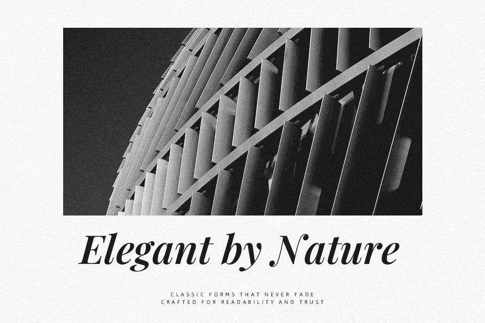
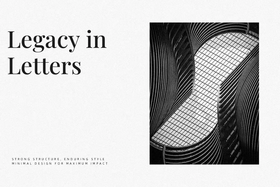
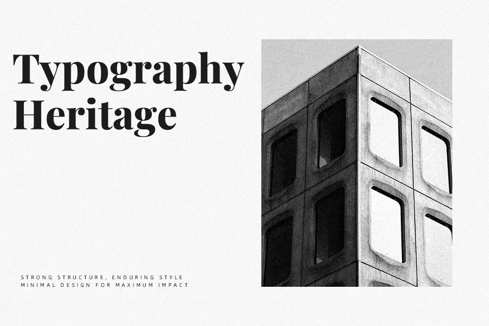
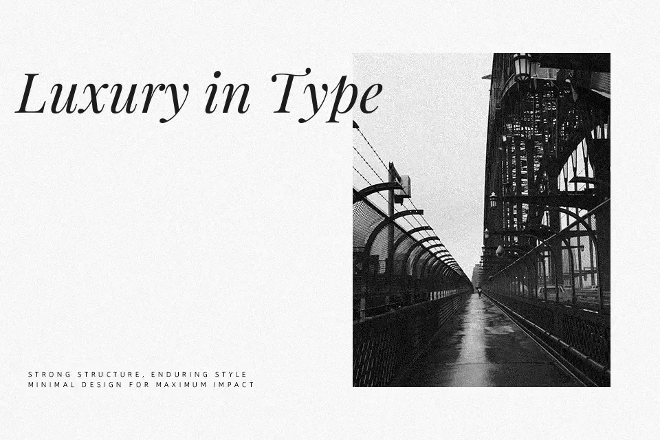
Playfair Display is a transitional serif with sharp, fine hairlines, generous contrast, and a tall x-height that keeps text readable even at smaller display sizes. Its structure feels refined and slightly dramatic, with upright posture and delicate serifs that add a sense of polish to titles, pull quotes, and hero banners. I like using it when a project needs a bookish, fashion-conscious voice—think magazines, boutique brands, or thoughtful blog layouts—especially when paired with a clean sans serif for body copy. It can feel too ornate for dense UI text or tiny captions, and the contrasty strokes may break down on low-res screens or over-busy backgrounds. If you enjoy classic Didone-inspired faces but want something more forgiving, this family hits a pragmatic middle ground.
Best For:
Editorial headlines and feature titles,Brand identities that lean classic and refined,Landing pages and hero banners with a literary tone,Invitations or event graphics that need a polished serif
Not Ideal For:
Tiny UI labels or dense app interfaces,Long-form body copy on small mobile screens,Overly minimal tech brands,Low-resolution or highly textured backgrounds
Perfect for branding, editorial, and headline, with a classic and display style.
License
Gallery