Petrona Font
Free for Commercial UseAbout
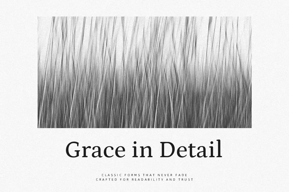
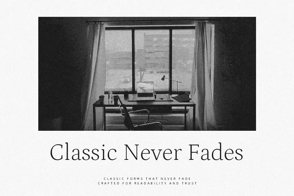
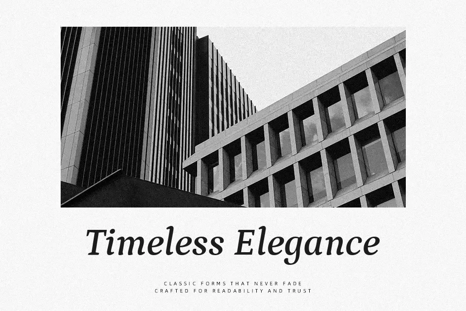
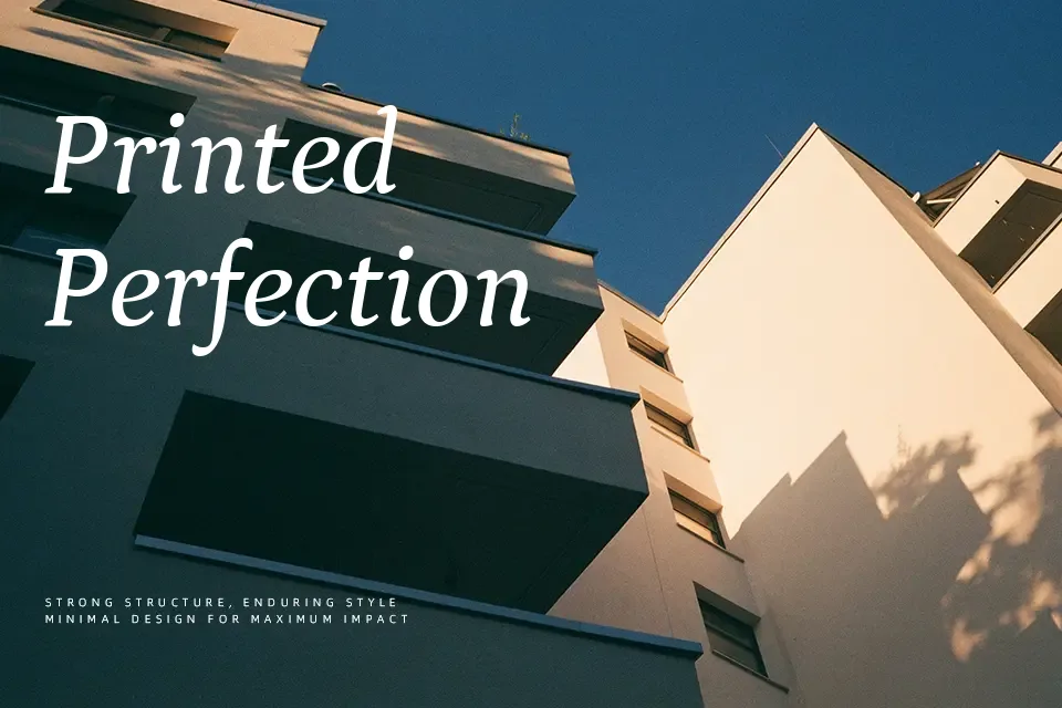
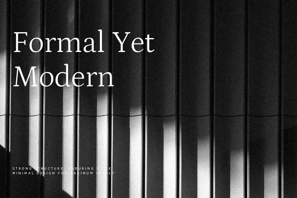
Petrona combines heavy, slightly eccentric serifs in the caps with open, tall lowercase letters and low stroke contrast, so text stays comfortable to read even at modest sizes. The generous x-height and pronounced ascenders give paragraphs a lively rhythm, while the weight range and italics help build hierarchy from quiet captions to assertive headlines. In practice, it shines in magazines, book interiors, thoughtful blogs, and brand systems that want warmth without slipping into nostalgia. If you need ultra-neutral corporate tone or very tight on-screen micro text, this design can feel a bit too characterful and spacious.
Best For:
Long-form editorial layouts
Book interiors and essays
Thoughtful brand systems
Refined web typography
Not Ideal For:
Very small UI labels
Highly technical documentation
Ultra-minimal corporate systems
Dense data tables and dashboards
Perfect for body text, branding, and editorial, with a classic and serif style.
License
Gallery