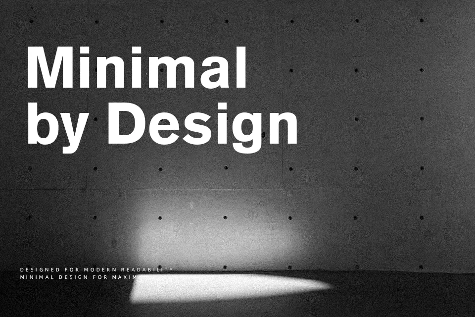
Akzidenz Grotesk Font
Free for personal useAbout
Before Helvetica defined the visual language of the 20th century, there was Akzidenz-Grotesk. Originally released by the Berthold Type Foundry in Berlin in 1898, this groundbreaking typeface established the blueprint for all modern grotesque sans-serifs. It is characterized by its strict, unadorned geometry, objective neutrality, and slight humanist quirks—such as slightly irregular proportions and organic terminal strokes—that give it a distinct character often lost in its more mechanical successors.
Because of its unparalleled neutrality and historical weight, it excels in serious applications like corporate identity systems, modernist architectural signage, and highly structured editorial design. Conversely, its cold, objective precision makes it entirely unsuitable for casual children’s book layouts or whimsical boutique branding, where its rigid structure will feel uninviting and overly clinical. It remains the absolute gold standard for pure, functional Swiss typography.
Best For:
– strict corporate identities
– modernist architectural signage
– objective editorial layouts
– museum exhibition typography
Not Ideal For:
– casual children’s books
– whimsical boutique branding
– decorative wedding invitations
Perfect for branding, editorial, and headline, with a classic and geometric style.
License
Gallery