Bienetresocial Font
Free for personal useAbout
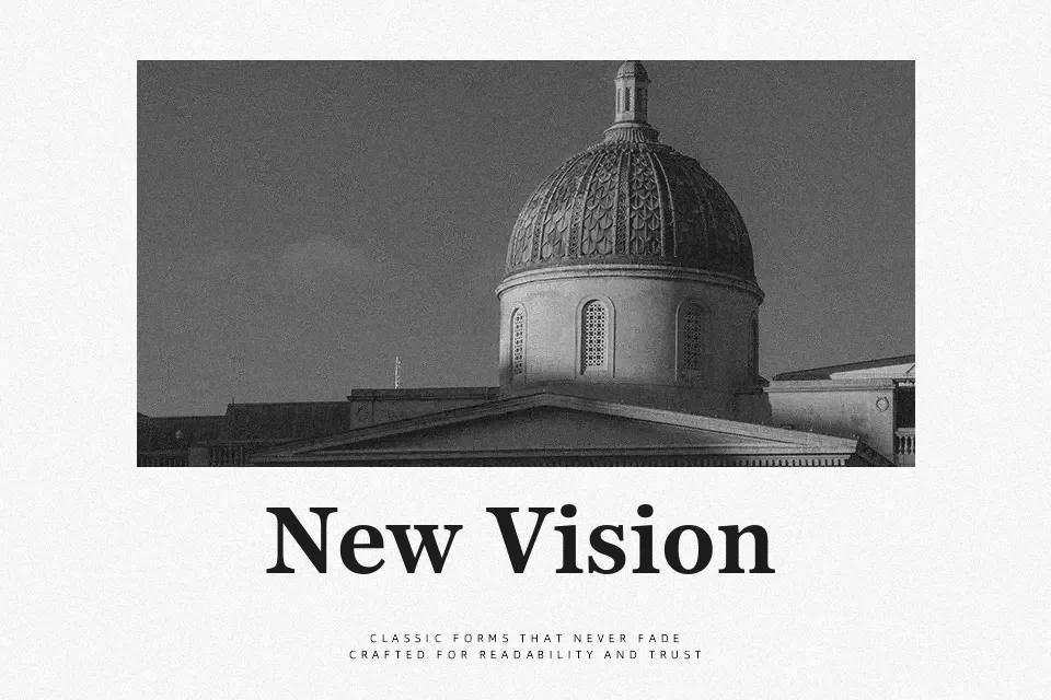
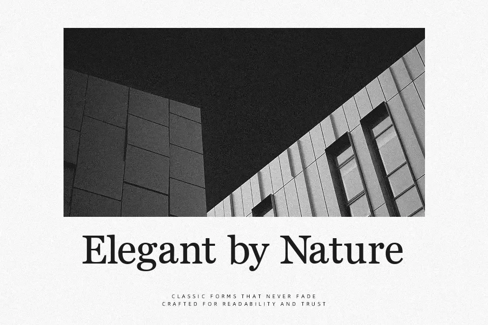
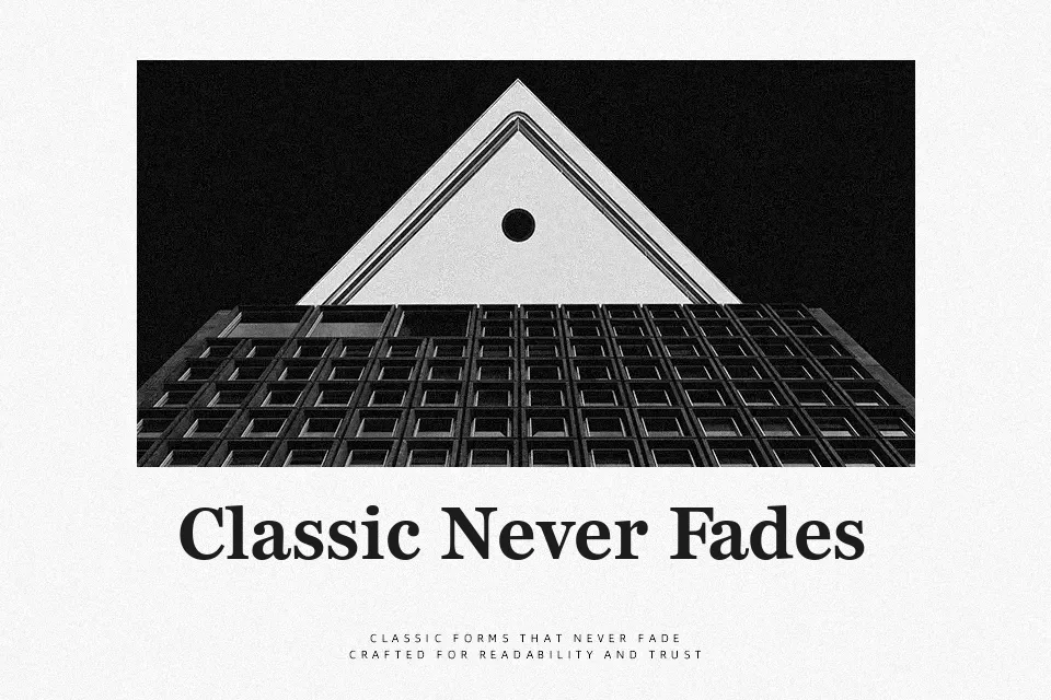
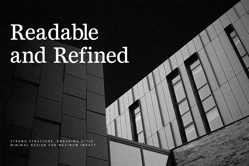
Starting with its foundational geometry, Bienetresocial Font presents a highly traditional and authoritative serif aesthetic. Designed by Claude Pelletier under the name Diogene, this typeface relies on strong, well-defined strokes and moderate contrast to produce a classic, balanced texture. The prominent serifs anchor each character firmly to the baseline, enhancing overall readability while providing an undeniable sense of elegance and formality.
In practical applications, this typeface excels in traditional print environments; it is an exceptional choice for academic journal layouts, formal event invitations, and serious book cover designs. Conversely, you should avoid using it for highly informal or playful children’s product packaging, as its rigid, classical structure feels much too serious and inflexible for lighthearted contexts. It offers a solid, if slightly conservative, alternative to Clarendon-style fonts.
Best For:
– classic book covers
– academic journal layouts
– formal wedding invitations
– traditional corporate branding
Not Ideal For:
– playful children’s packaging
– futuristic tech websites
– casual mobile app interfaces
Perfect for branding, editorial, and headline, with a classic and decorative style.
License
Gallery