Diary Of A Wimpy Kid Font
Free for personal useAbout
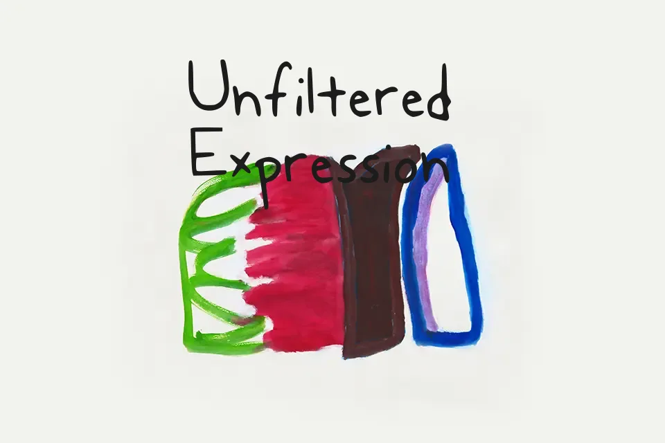
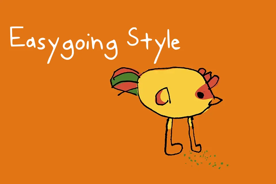
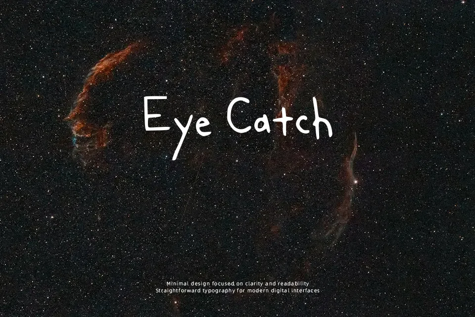
Reviewing the Diary Of A Wimpy Kid font reveals a deliberate embrace of imperfection. The letterforms are highly irregular, featuring uneven baselines, inconsistent stroke weights, and slightly slanted vertical lines. This faithfully recreates the look of Jeff Kinney’s original book lettering—a casual, sketched aesthetic that feels like it was drawn quickly with a felt-tip pen in a notebook. It is a highly effective choice for illustrating web comics, formatting children’s storybooks, or creating playful, youthful greeting cards. However, the intentional “messiness” that makes it so charming is also its biggest flaw. The font looks entirely out of place in serious contexts, and the irregular spacing makes lengthy paragraphs difficult to scan. It should be strictly limited to informal display text or short dialogue bubbles where its childish personality is appropriate.
Best For:
children’s book dialogue
playful greeting cards
comic strip lettering
Not Ideal For:
professional corporate websites
formal event invitations
dense editorial body copy
Perfect for kids, packaging, and poster, with a creative and cartoon style.
License
Gallery