Palanquin Dark Font
Free for Commercial UseAbout
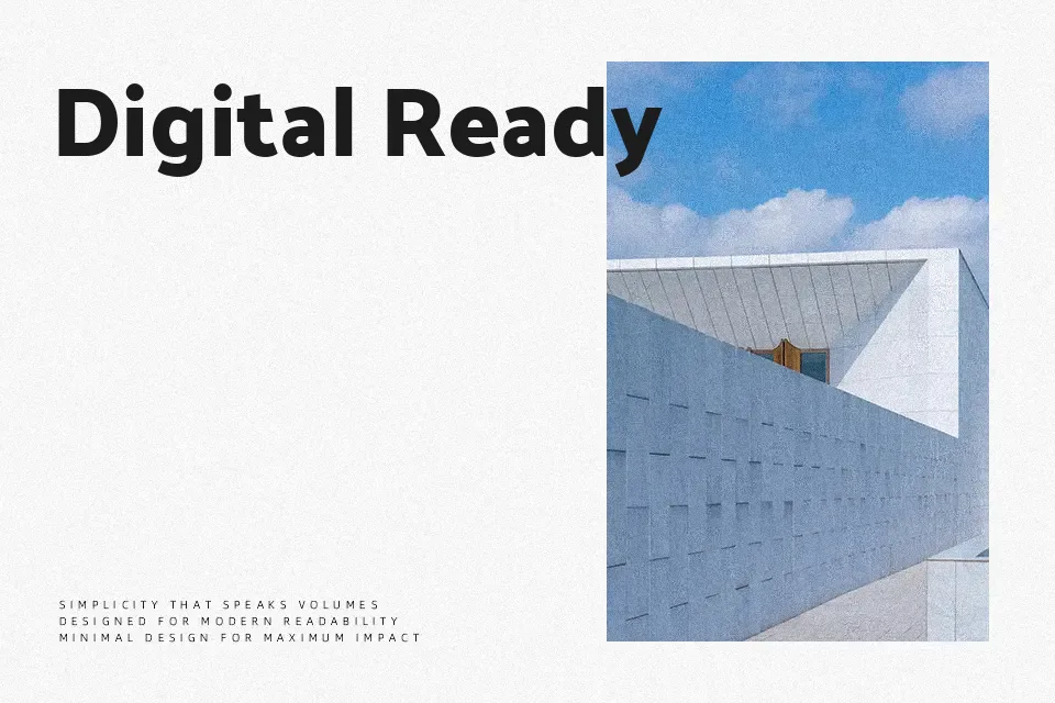
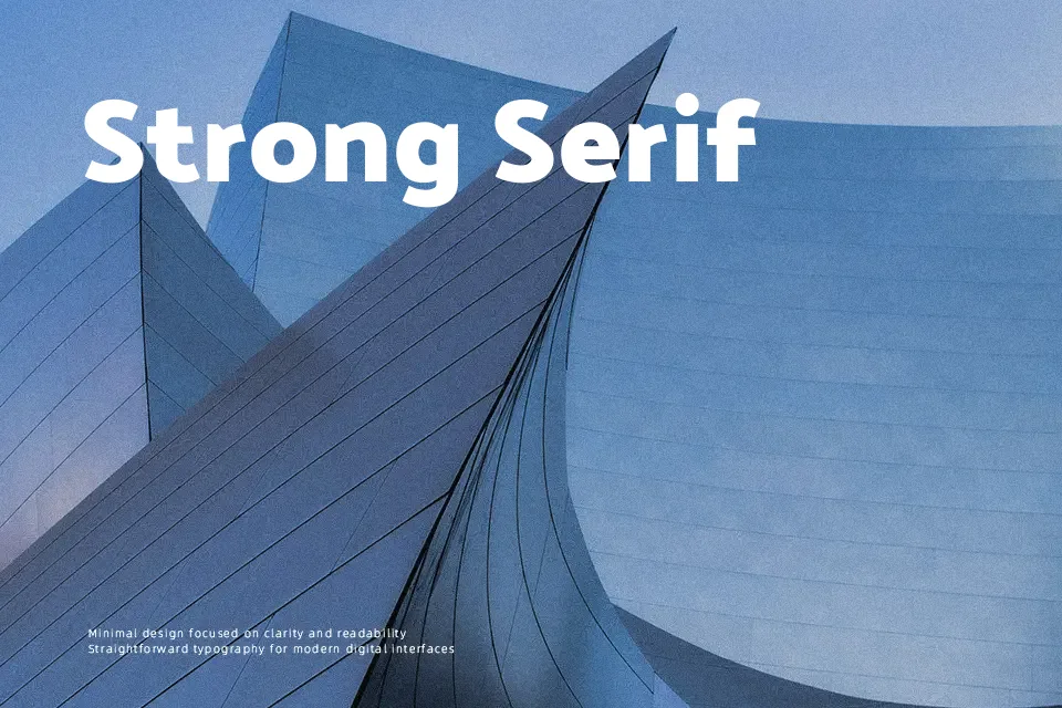
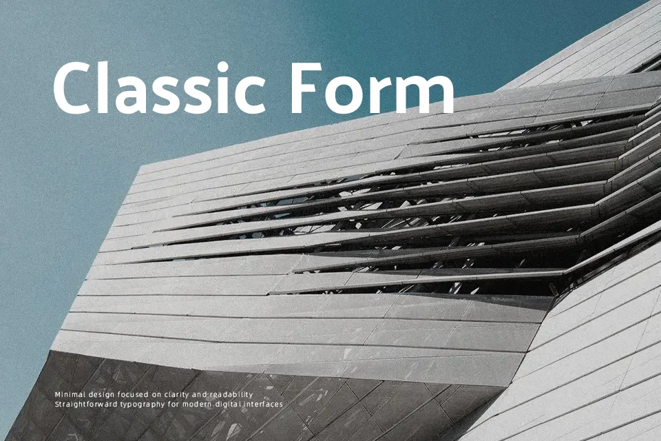
Palanquin Dark pushes the humanist structure of Palanquin into a denser, darker weight, with compact counters, firm verticals, and restrained curves that read clearly even at smaller display sizes. Its strokes feel uniform but not mechanical, so the font stays functional rather than shouty, giving headlines and buttons a confident, contemporary tone. On small screens it handles labels, filters, and menu items well; in print, it suits bold section titles, infographics, and wayfinding where hierarchy matters more than ornament. It tends to feel heavy in long paragraphs or very refined editorial layouts, so pairing it with a lighter text face usually produces a more comfortable reading experience.
Best For:
Bold UI labels and navigation in apps or dashboards
Short headlines in digital editorials and product pages
Data-heavy graphics, tags, and badges that need clear hierarchy
Not Ideal For:
Long-form body text or dense paragraphs
Highly ornate, luxury-driven branding systems
Layouts that rely on very delicate or airy typography
Perfect for advertising, editorial, and headline, with a bold and display style.
License
Gallery