Alegreya Sans SC Font
Free for Commercial UseAbout
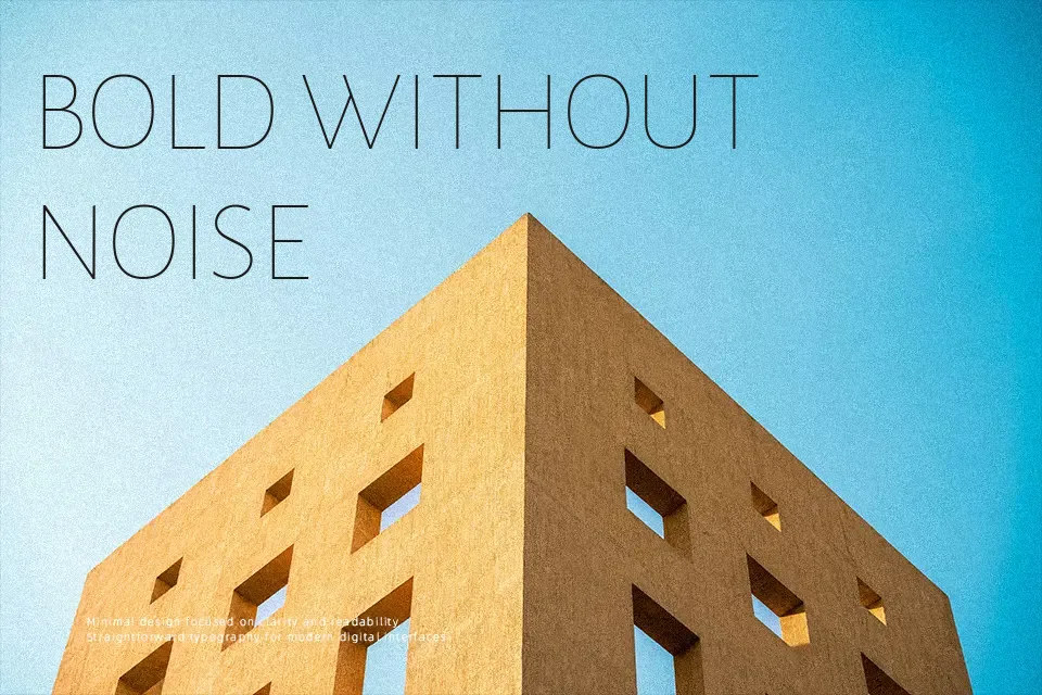
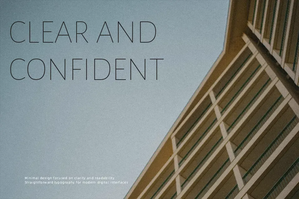
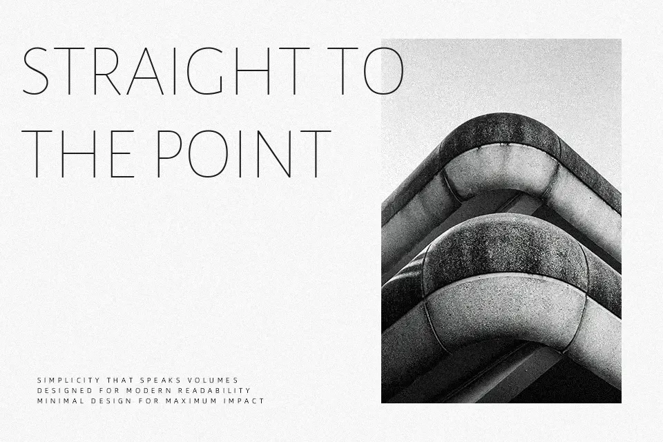
Designed as the dedicated small caps companion to Alegreya Sans, this typeface carries a distinctive calligraphic undertone through its stroke modulation — subtle enough to stay neutral, but present enough to add warmth to otherwise flat text. The letterforms follow classical humanist proportions with open apertures and varied rhythm across characters, which noticeably reduces reading fatigue in extended passages.
It works best in contexts where formality and readability share equal weight: think chapter headings in digital literary journals, styled subheadings inside long-form editorial pieces, or running headers on content-heavy websites. The all-small-caps structure also suits navigation labels and bibliographic text particularly well.
Where it loses ground is in expressive or attention-grabbing work — youth-facing brand campaigns, bold poster headlines, or streetwear identity design will find the tone too restrained and the silhouette too even to carry visual impact.
Best For:
editorial subheadings and chapter openers
formal web navigation and running headers
long-form body text in literary or academic contexts
print and digital publication layouts
Not Ideal For:
bold display headlines requiring visual impact
streetwear or youth-facing brand identities
short punchy social media graphics
Perfect for body text, branding, and editorial, with a classic and sans serif style.
License
Gallery