Oswald Font
Free for Commercial UseAbout
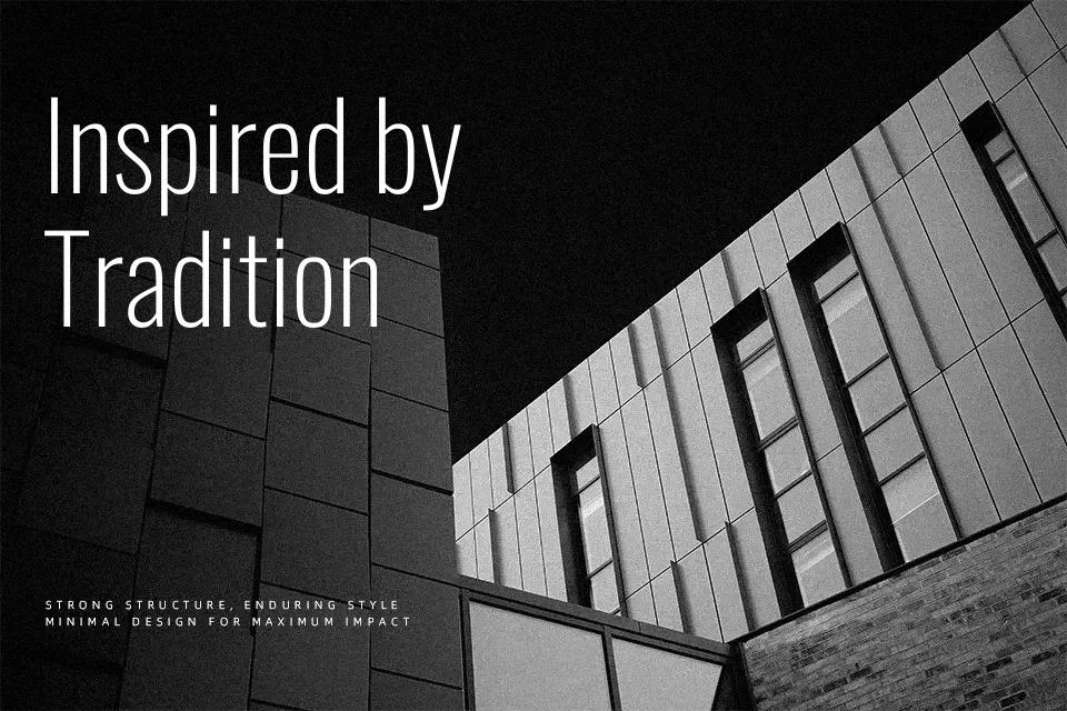
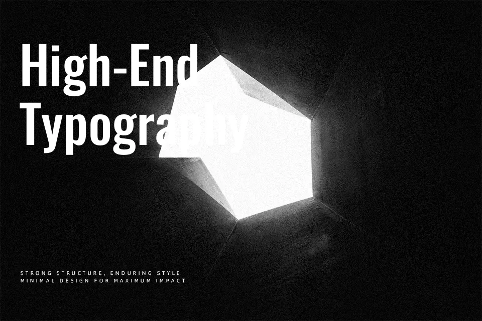
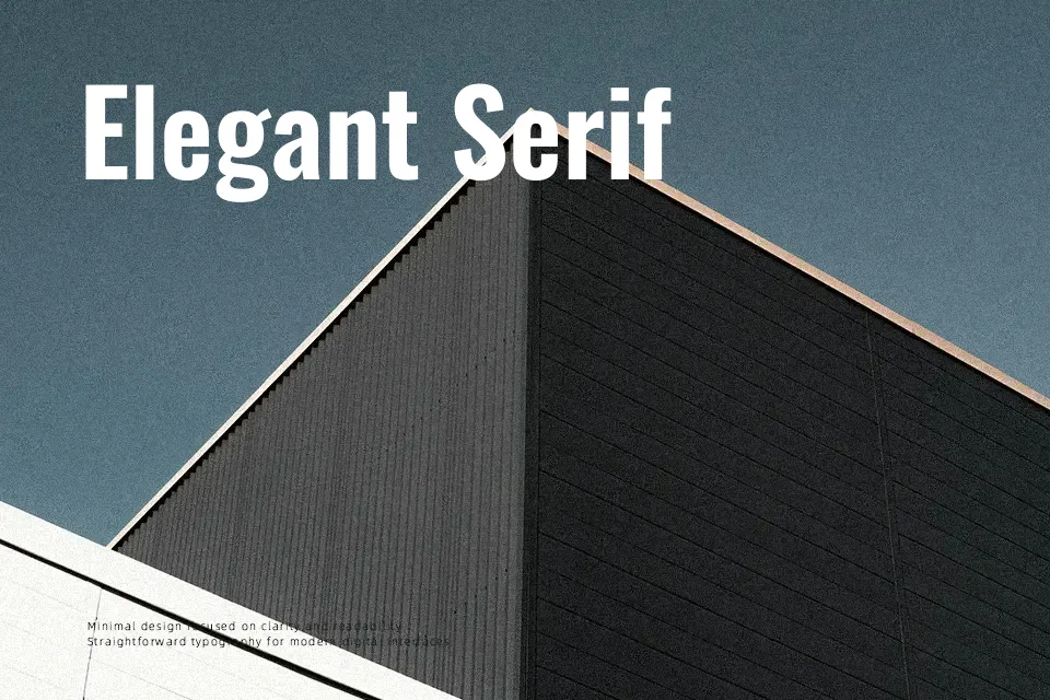
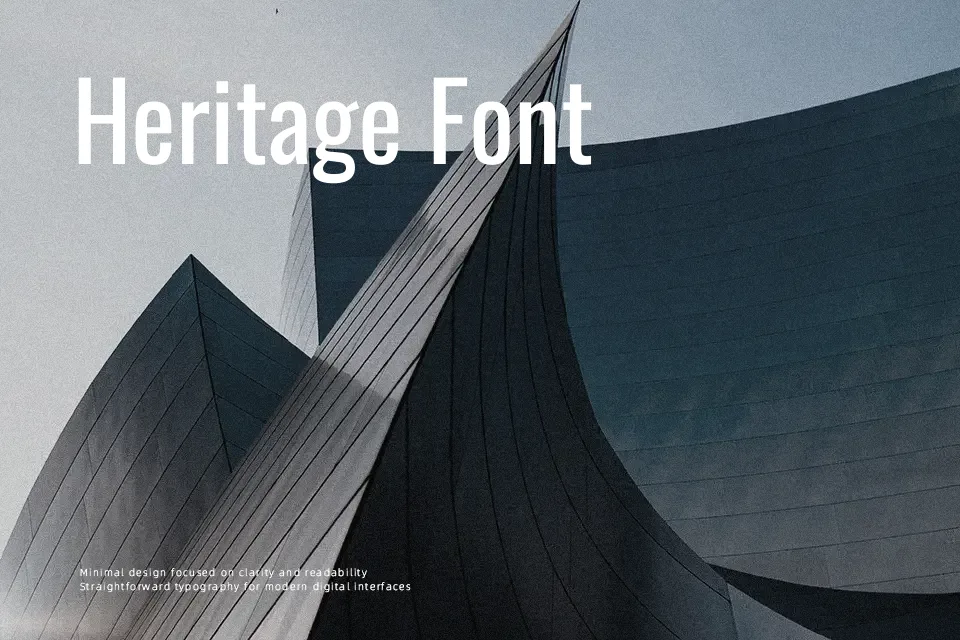
Oswald reshapes classic condensed gothic sans serif lettering into a cleaner, screen-optimized family with narrow proportions, straight-sided strokes, and compact spacing that still reads clearly at a glance. The overall impression feels serious, modern, and slightly utilitarian, which suits brands that want to sound confident rather than playful. It shines in stacked headlines, navigation labels, and bold callouts where vertical rhythm matters more than airy spacing, especially on websites and digital products. For long body copy or highly expressive branding, its tight structure can feel stiff and repetitive, so pairing it with a more relaxed text face often produces a better balance, similar to how designers mix other condensed grotesks with friendlier companions.
Best For:
Strong website or app headlines and navigation labels on narrow layouts
Posters, banners, or social graphics that need tall, space-efficient typography
Branding systems that lean toward structured, no-nonsense sans serif typography
Not Ideal For:
Long-form body text where the condensed width can strain readability
Soft, playful, or highly decorative branding that needs more personality in the letterforms
Projects demanding wide, airy typography with generous tracking and open counters
Perfect for branding, headline, and poster, with a bold and condensed style.
License
Gallery