Nerko One Font
Free for Commercial UseAbout
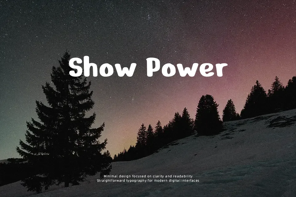
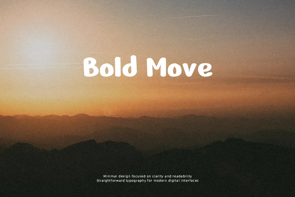
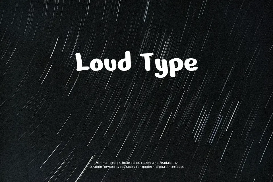
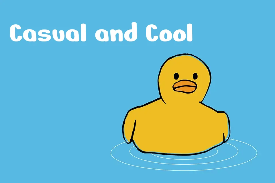
Nerko One leans into a thick, rounded marker aesthetic, with consistent heavy strokes, loose curves, and slightly irregular letterforms that read as informal and hand-drawn rather than polished. The generous x-height and open counters help letters stay readable at medium sizes, though tight spacing can feel dense if you push it too small or cram too much text into one line. Visually it sits somewhere between a cartoon display style and casual brush lettering, which makes it comfortable in fun, youth-oriented projects. I like using it for short, loud words on posters, YouTube thumbnails, and kids snacks or toy packaging, where the chunky shapes feel playful instead of clumsy. For long paragraphs, formal branding, or minimalist layouts, the same thickness and bounce quickly become tiring and out of place, so it is better kept as an accent voice rather than your only typeface.
Best For:
playful display headlines
kids product packaging
social media graphics
casual poster titles
Not Ideal For:
long paragraphs
formal documents
minimalist corporate branding
tiny UI labels
Perfect for branding, kids, and logo, with a bold and display style.
License
Gallery