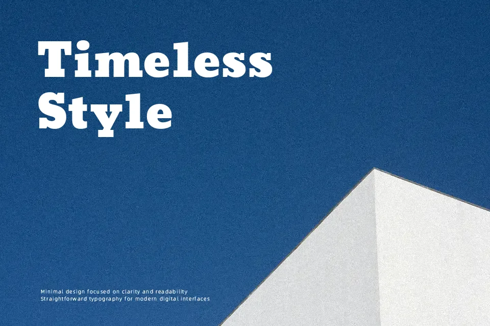
Moul Font
Free for Commercial UseAbout
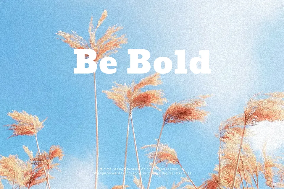
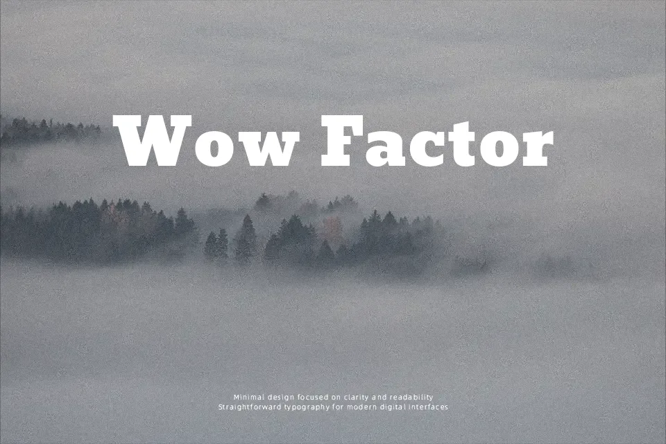
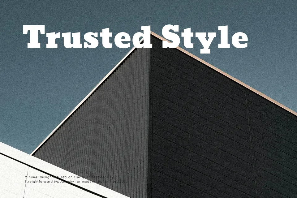
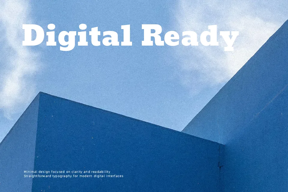
Moul translates classical Khmer calligraphic tradition into a structured, heavyweight display typeface. Its letterforms are thick and upright, with tight inter-character spacing that gives text a compact, block-like density. The Clarendon-influenced slab serif construction brings visual firmness without tipping into coldness — there’s a warmth in the rounded terminals that keeps it from feeling mechanical.
The font earns real credibility at display sizes: cultural event promotions, Cambodian restaurant fascias, multilingual editorial spreads, and heritage branding where both Khmer and Latin scripts need to share consistent visual weight. The Latin subset is usable but clearly secondary — the genuine character of this typeface lives entirely in its Khmer glyphs.
Don’t push it into small-scale or continuous reading contexts. At body-text sizes, the stroke density works against legibility, and the display-weight construction doesn’t adapt well to UI labels or dense editorial copy.
Best For:- Khmer-language headlines and titles
– Cultural event and festival posters
– Multilingual signage with Khmer and Latin
– Heritage or traditional branding layouts
Not Ideal For:- Body text or long-form reading
– Small-size UI labels or navigation
– Modern minimalist design systems
Perfect for advertising, branding, and editorial, with a ancient and display style.
License
Gallery