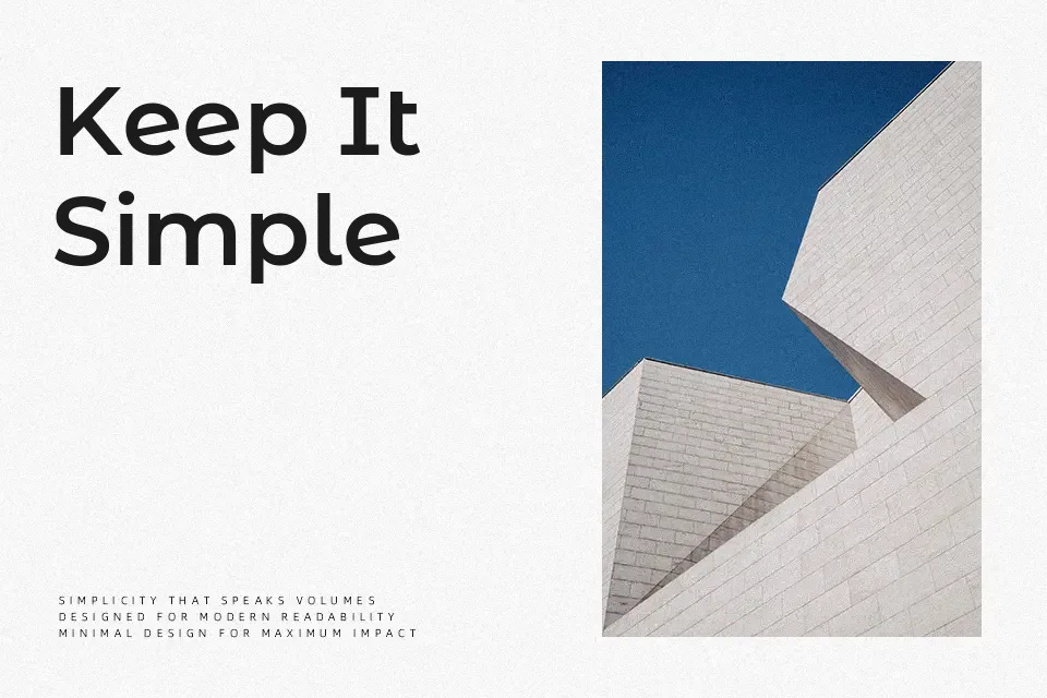
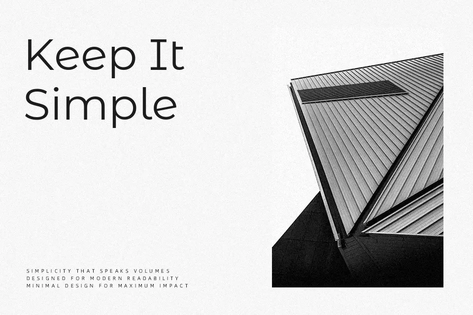
Montserrat Alternates Font

Free for Commercial Use

A A
MontserratAlternates-Thin.ttf
The quick brown fox jumps over the lazy dog
MontserratAlternates-ThinItalic.ttf
The quick brown fox jumps over the lazy dog
MontserratAlternates-ExtraLight.ttf
The quick brown fox jumps over the lazy dog
MontserratAlternates-ExtraLightItalic.ttf
The quick brown fox jumps over the lazy dog
MontserratAlternates-Light.ttf
The quick brown fox jumps over the lazy dog
MontserratAlternates-LightItalic.ttf
The quick brown fox jumps over the lazy dog
MontserratAlternates-Regular.ttf
The quick brown fox jumps over the lazy dog
MontserratAlternates-Italic.ttf
The quick brown fox jumps over the lazy dog
MontserratAlternates-Medium.ttf
The quick brown fox jumps over the lazy dog
MontserratAlternates-MediumItalic.ttf
The quick brown fox jumps over the lazy dog
MontserratAlternates-SemiBold.ttf
The quick brown fox jumps over the lazy dog
MontserratAlternates-SemiBoldItalic.ttf
The quick brown fox jumps over the lazy dog
MontserratAlternates-Bold.ttf
The quick brown fox jumps over the lazy dog
MontserratAlternates-BoldItalic.ttf
The quick brown fox jumps over the lazy dog
MontserratAlternates-ExtraBold.ttf
The quick brown fox jumps over the lazy dog
MontserratAlternates-ExtraBoldItalic.ttf
The quick brown fox jumps over the lazy dog
MontserratAlternates-Black.ttf
The quick brown fox jumps over the lazy dog
MontserratAlternates-BlackItalic.ttf
The quick brown fox jumps over the lazy dog

About

Where the standard Montserrat keeps things neutral, Alternates introduces character-level variations — a single-story lowercase ‘a’, subtly angled terminals, and reshaped cap constructions — that give the same geometric skeleton a more expressive voice. Stroke contrast remains low, spacing is open, and the overall texture is clean enough for screen rendering at small sizes. The 18-weight range (Thin through Black) supports typographic hierarchy from fine editorial subheadings down to heavy display use. It works well in brand systems that need a sans-serif with just enough personality to avoid feeling interchangeable. That said, the alternate letterforms can feel slightly restless in long body copy, and the loose spacing makes it a poor fit for dense text settings like annual reports or legal documentation.

Best For:- editorial cover headlines
– app UI header text
– streetwear and lifestyle branding
– poster typography with typographic hierarchy

Not Ideal For:- dense body copy in print documents
– formal corporate or legal text layouts

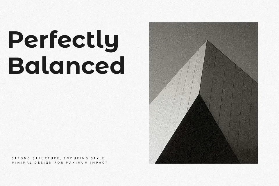
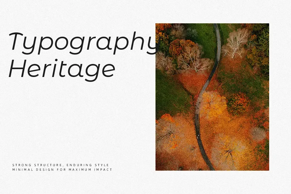
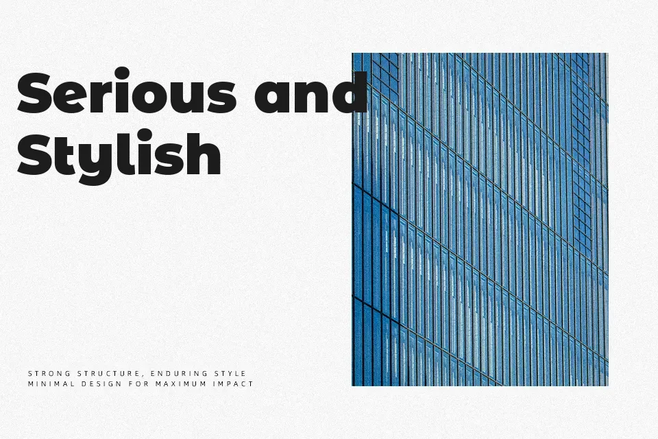
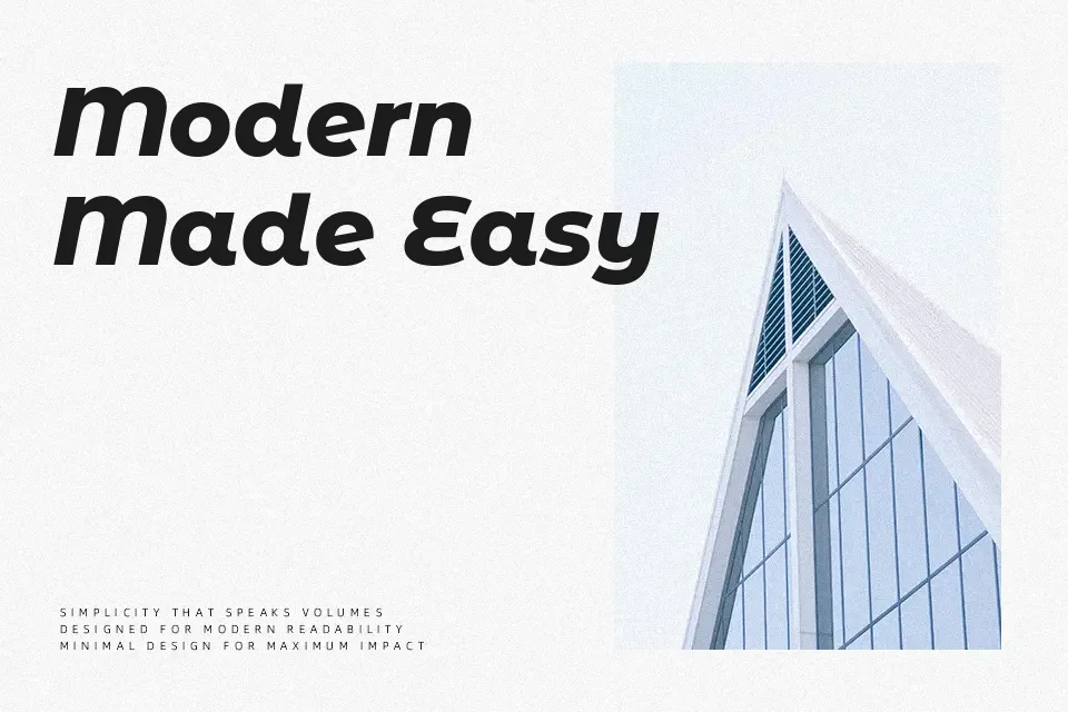
Perfect for branding, editorial, and headline, with a clean and geometric style.

License

check
Free for commercial use
This font may be used in commercial design projects such as branding, advertising, and visual content. Usage rights may vary depending on the license terms. Please review the license details for specific restrictions.
check
Free for personal use
You can also use this font freely in personal and non-commercial projects.
Montserrat Alternates Font is licensed under the SIL Open Font License (OFL).
Montserrat Alternates Font is distributed under the OFL.txt. The full license document is included in the downloaded package.

Similar Fonts

You may also like

Fonts by Language

How to Use Montserrat Alternates Font

  1. Download the font file.
  2. Install it on your device (TTF or OTF format).
  3. Use it in your favorite design tools, such as Photoshop, Illustrator, or Canva.

Montserrat Alternates Font FAQ

Q: Is this font free for commercial use?

A: This font is released under the SIL Open Font License (OFL), which generally allows both personal and commercial use. Please review the license for specific conditions or contact the author if you have any questions.

Q: Can I use this font for logos or branding?

A: This font can typically be used for logos and branding, subject to the OFL terms. For further clarification, please contact the author.

Q: What file formats are included?

A: Most fonts include TTF or OTF files.