Alan Sans Font
Free for Commercial UseAbout
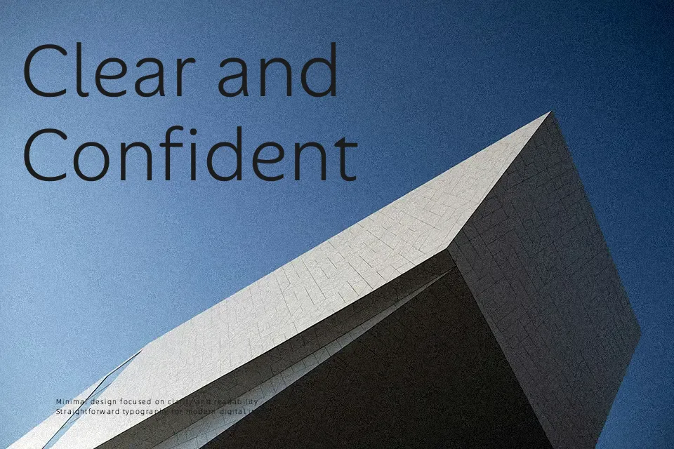
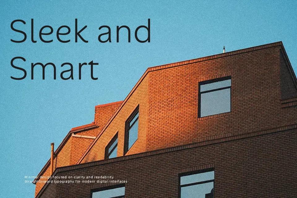
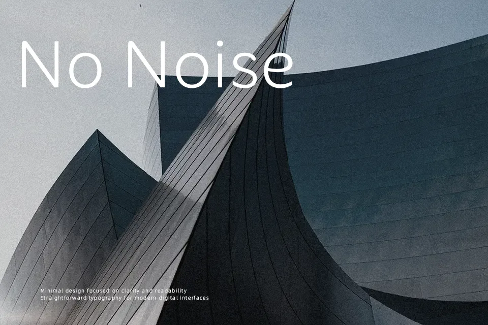
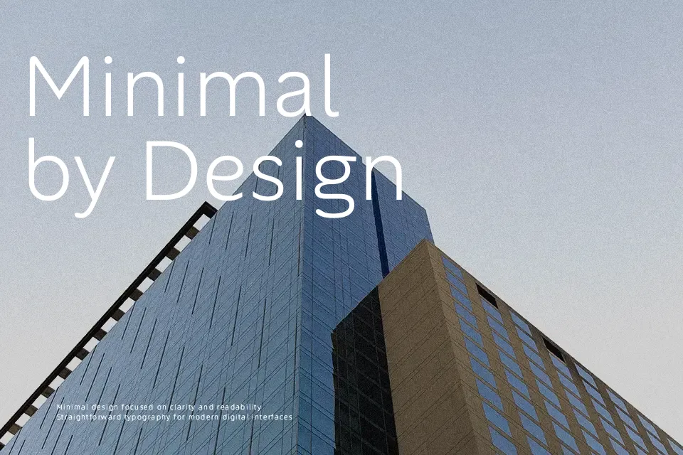
Alan Sans blends geometric structure with humanist warmth through softly rounded terminals and generous apertures. The even stroke distribution and slightly condensed letterforms create approachable readability, especially in medium to large sizes. It excels in interface design—try it for mobile app menus or fintech dashboards where friendly professionalism matters. The extensive weight range supports visual hierarchy without losing character coherence. While its modern simplicity shines in digital contexts, the distinctive lowercase ‘g’ and ‘a’ can reduce legibility in dense financial reports or traditional publishing layouts. Compared to rigid neo-grotesques, Alan Sans feels more inviting yet remains sharper than rounded alternatives like Quicksand.
Best For:
app interfaces
startup branding
digital headlines
product packaging
Not Ideal For:
legal documents
academic journals
historic restoration projects
Perfect for branding, headline, and ui design, with a friendly and geometric style.
License
Gallery