42 Font
Free for personal useAbout
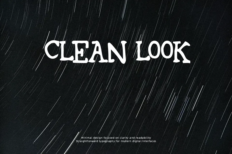
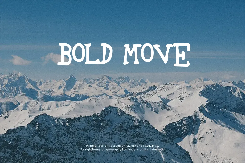
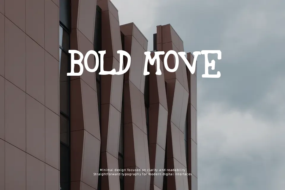
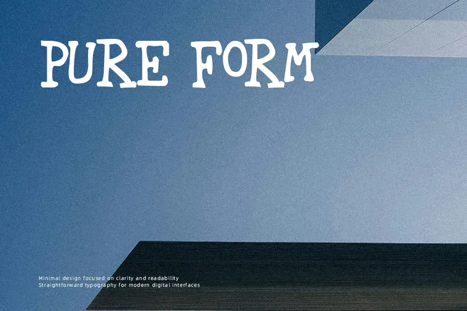
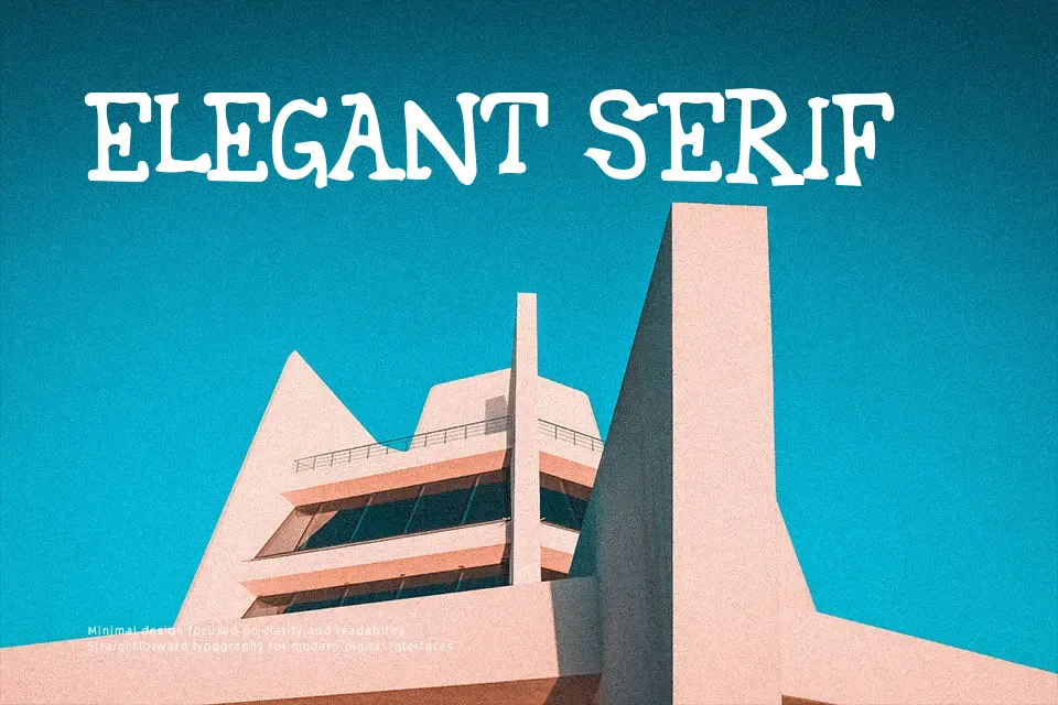
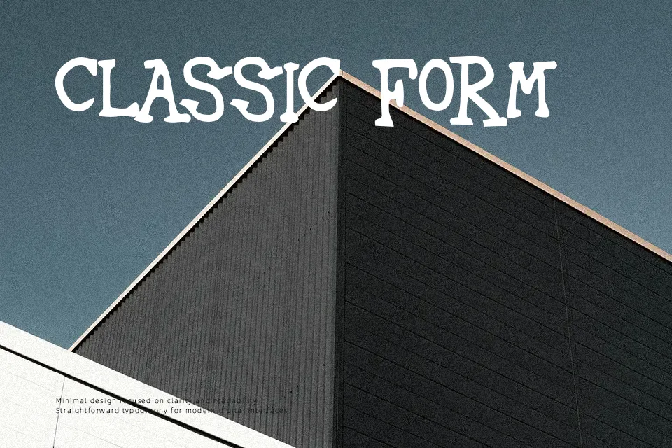
At first glance, 42 Font reads like something pulled from an arcade cabinet or retro scoreboard — thick strokes, tight spacing, and a rigid geometric structure give it a machine-like density. The letterforms feel deliberate and compressed, built for impact rather than flow. It holds up well in poster headlines, game UI labels, or event titles where you want a font that carries weight without needing ornamentation. That said, the stylized construction makes it a poor fit for running text or any context requiring extended reading — the quirky geometry wears out fast at body sizes. It works best when used sparingly, letting the visual punch do the talking rather than overwhelming a layout.
Best For:
– Gaming event posters or tournament graphics
– Retro-themed merchandise or apparel labels
– Short headline text in editorial layouts
– Music or album cover titling
Not Ideal For:
– Body text or multi-line paragraphs
– Corporate branding or formal documents
– Small-size applications like captions or footnotes
– Multilingual or mixed-script layouts
Perfect for branding, gaming, and headline, with a bold and display style.
License
Gallery