1550 Font
Free for Commercial UseAbout
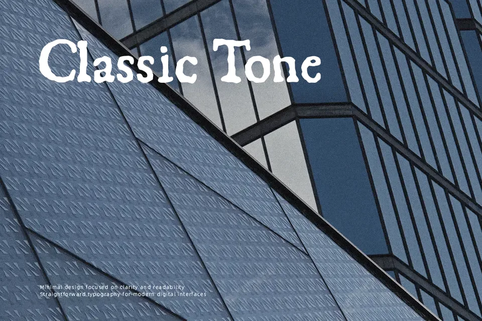
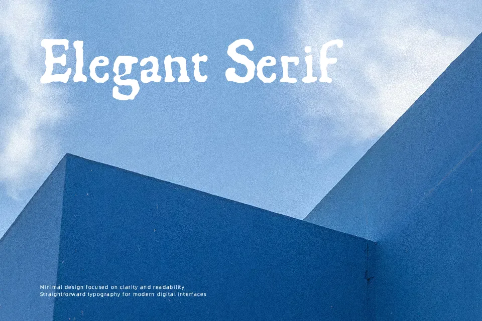
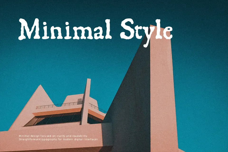
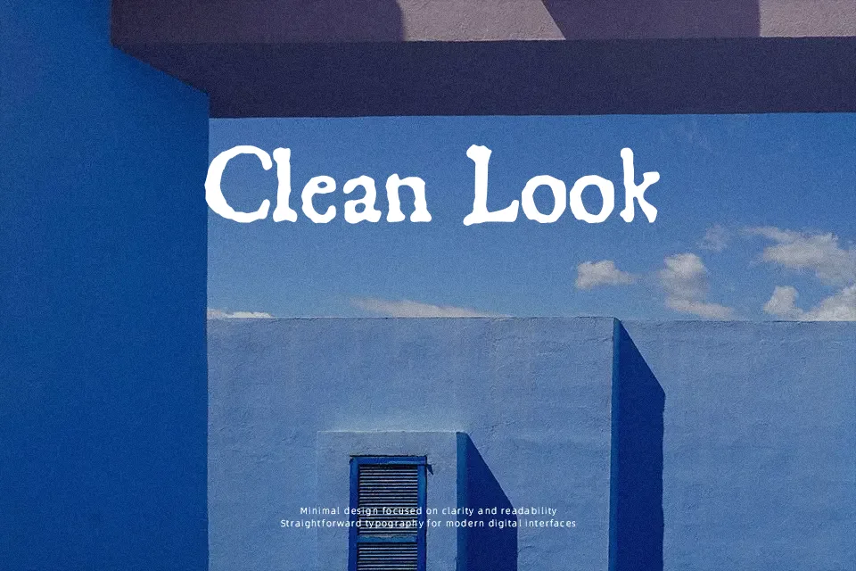
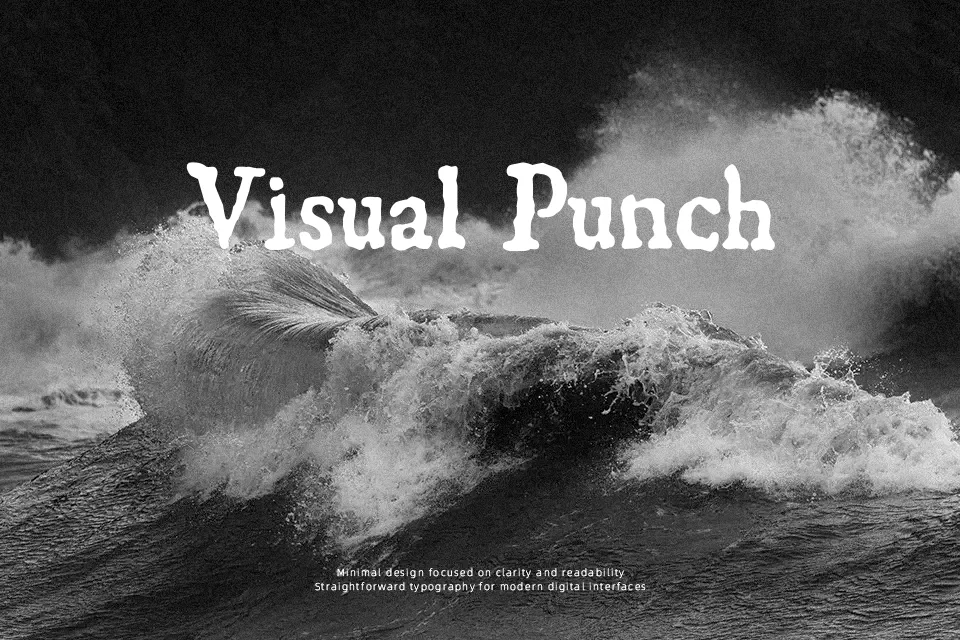
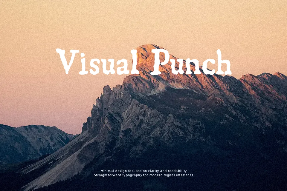
The strokes carry visible erosion — uneven edges, irregular ink distribution, and the kind of structural irregularity you’d expect from a woodblock-printed page circa 1550. This is not a polished revival; it reads more like a direct scan of original lettrines, which is exactly its strength. That quality makes it genuinely compelling for historical posters, museum exhibit headers, medieval-themed packaging, or any project where fabricated age would look cheap but real reference looks convincing. The caveat: lowercase support is limited and legibility suffers significantly at small sizes. This font demands space — set it large or don’t set it at all.
Best For:
– Historical poster and broadsheet-style headers
– Medieval or Renaissance-themed book cover titles
– Museum exhibit signage and period editorial decoration
– Decorative drop caps and ornamental lettrines
Not Ideal For:
– Body text or extended reading passages
– Digital UI and screen-based interfaces
– Corporate or modern branding contexts
– Small print sizes where eroded edges become noise
Perfect for editorial, headline, and packaging, with a ancient and blackletter style.
License
Gallery